For this lesson, we're going to use the gapminder data, which can be found in its original form here. If you're reading this and not attending the class, I would highly encourage you to check out the website! The late Hans Rosling was a brilliant guy and his work, followed up by children, is worth digging through.
The main purpose of this exercise is to learn how to graph your data; however, we first need to understand the (subjectively) best format for data, tidy data. Last, we'll go more in depth to see how to take advantage of ggplots dimensionality. So, in this lesson we will actually cover three things:
- Tidy Data (for graphing purposes)
- R Graphics with ggplot2
- Dimensions in ggplot2
There are two sets of data I want to focus on. The first is simply population data. Download the data by clicking this link.
Open a new script and read the data into your environment. Let's title this data gapminder_IncomePerCap and assign it as such; gapminder_IncomePerCap <- read.csv("income_per_person.csv"). Note that you'll have to specify the path relative to your directory.
Tidy Data
Let's look at the data you've loaded in.
str(gapminder_IncomePerCap)## 'data.frame': 193 obs. of 242 variables:
## $ country: Factor w/ 193 levels "Afghanistan",..: 1 2 3 4 5 6 7 8 9 10 ...
## $ X1800 : int 603 667 715 1200 618 757 1510 514 814 1850 ...
## $ X1801 : int 603 667 716 1200 620 757 1510 514 816 1850 ...
## $ X1802 : int 603 667 717 1200 623 757 1510 514 818 1860 ...
## $ X1803 : int 603 667 718 1200 626 757 1510 514 820 1870 ...
## $ X1804 : int 603 667 719 1210 628 757 1510 514 822 1880 ...
## $ X1805 : int 603 668 720 1210 631 757 1510 514 824 1880 ...
## $ X1806 : int 603 668 721 1210 634 757 1510 514 825 1890 ...
## $ X1807 : int 603 668 722 1210 637 758 1510 514 827 1900 ...
## $ X1808 : int 603 668 723 1220 640 758 1510 514 829 1910 ...
## $ X1809 : int 603 668 724 1220 642 758 1510 514 831 1920 ...
## $ X1810 : int 604 668 725 1220 645 758 1510 514 833 1920 ...
## $ X1811 : int 604 668 726 1220 648 758 1510 515 835 1930 ...
## $ X1812 : int 604 668 727 1220 651 758 1510 515 837 1940 ...
## $ X1813 : int 604 668 728 1230 654 758 1510 515 839 1950 ...
## $ X1814 : int 604 668 729 1230 657 758 1510 515 841 1950 ...
## $ X1815 : int 604 669 730 1230 660 758 1510 515 843 1960 ...
## $ X1816 : int 604 669 731 1230 662 759 1510 515 845 1970 ...
## $ X1817 : int 604 669 732 1240 665 759 1510 515 847 1980 ...
## $ X1818 : int 604 669 733 1240 668 759 1510 515 849 1990 ...
## $ X1819 : int 604 669 734 1240 671 759 1510 515 851 1990 ...
## $ X1820 : int 604 669 735 1240 674 759 1510 515 853 2000 ...
## $ X1821 : int 607 671 743 1260 677 764 1530 517 860 2030 ...
## $ X1822 : int 609 672 751 1270 680 769 1560 519 886 2070 ...
## $ X1823 : int 611 674 759 1290 683 775 1580 521 916 2100 ...
## $ X1824 : int 613 675 767 1300 686 780 1600 523 967 2140 ...
## $ X1825 : int 615 677 775 1320 689 785 1620 525 1010 2170 ...
## $ X1826 : int 617 678 784 1330 692 790 1640 527 1030 2200 ...
## $ X1827 : int 619 680 792 1350 695 796 1670 529 1060 2240 ...
## $ X1828 : int 621 681 801 1360 698 801 1690 531 1090 2280 ...
## $ X1829 : int 623 683 810 1380 701 806 1720 533 1150 2310 ...
## $ X1830 : int 625 684 819 1400 704 812 1740 535 1400 2350 ...
## $ X1831 : int 627 686 828 1410 708 817 1770 538 1450 2380 ...
## $ X1832 : int 630 688 837 1430 711 823 1790 540 1480 2400 ...
## $ X1833 : int 632 689 846 1450 714 828 1820 542 1480 2430 ...
## $ X1834 : int 634 691 855 1460 717 834 1840 544 1560 2450 ...
## $ X1835 : int 636 692 864 1480 720 840 1870 546 1890 2480 ...
## $ X1836 : int 638 694 874 1500 723 845 1900 548 1860 2500 ...
## $ X1837 : int 640 695 883 1520 726 851 1920 550 1950 2530 ...
## $ X1838 : int 643 697 893 1540 730 857 1950 552 1920 2550 ...
## $ X1839 : int 645 699 903 1550 733 863 1980 554 1790 2580 ...
## $ X1840 : int 647 700 912 1570 736 868 2010 556 2270 2610 ...
## $ X1841 : int 649 702 922 1590 739 874 2040 559 1940 2640 ...
## $ X1842 : int 651 703 932 1610 743 880 2060 561 1760 2660 ...
## $ X1843 : int 654 705 943 1630 746 886 2090 563 2050 2690 ...
## $ X1844 : int 656 707 953 1650 749 892 2120 565 2330 2720 ...
## $ X1845 : int 658 708 963 1670 752 898 2150 567 2400 2750 ...
## $ X1846 : int 660 710 974 1690 756 904 2180 569 2650 2780 ...
## $ X1847 : int 663 711 984 1710 759 910 2220 572 3060 2810 ...
## $ X1848 : int 665 713 995 1730 762 917 2250 574 3500 2840 ...
## $ X1849 : int 667 715 1010 1750 766 923 2280 576 3460 2880 ...
## $ X1850 : int 669 716 1020 1770 769 929 2310 578 3270 2910 ...
## $ X1851 : int 672 718 1030 1790 773 935 2340 581 3880 2940 ...
## $ X1852 : int 674 720 1040 1810 776 942 2380 583 4550 2960 ...
## $ X1853 : int 676 721 1050 1830 779 948 2410 585 4980 2990 ...
## $ X1854 : int 678 723 1060 1860 783 954 2450 587 4360 3020 ...
## $ X1855 : int 681 724 1070 1880 786 961 2480 590 4140 3050 ...
## $ X1856 : int 683 726 1080 1900 790 967 2520 592 5050 3080 ...
## $ X1857 : int 685 728 1100 1920 793 974 2550 594 4460 3110 ...
## $ X1858 : int 688 729 1110 1940 797 980 2590 596 3800 3140 ...
## $ X1859 : int 690 731 1120 1970 800 987 2630 599 4910 3170 ...
## $ X1860 : int 692 733 1130 1990 804 994 2660 601 4790 3200 ...
## $ X1861 : int 695 734 1150 2020 807 1000 2700 603 4720 3230 ...
## $ X1862 : int 697 736 1160 2040 811 1010 2740 606 4540 3250 ...
## $ X1863 : int 699 738 1170 2060 814 1010 2780 608 4520 3270 ...
## $ X1864 : int 702 739 1180 2090 818 1020 2820 610 4800 3300 ...
## $ X1865 : int 704 741 1200 2110 822 1030 2860 613 4580 3320 ...
## $ X1866 : int 707 743 1210 2140 825 1040 2900 615 4710 3340 ...
## $ X1867 : int 709 745 1220 2160 829 1040 2940 617 5150 3370 ...
## $ X1868 : int 711 746 1240 2190 832 1050 2980 620 5230 3390 ...
## $ X1869 : int 714 748 1250 2220 836 1060 3030 622 5130 3410 ...
## $ X1870 : int 716 750 1260 2240 840 1060 3070 625 5430 3440 ...
## $ X1871 : int 719 761 1280 2270 844 1070 3110 627 5470 3660 ...
## $ X1872 : int 721 772 1290 2300 847 1080 3160 629 5890 3660 ...
## $ X1873 : int 724 784 1300 2320 851 1080 3200 632 6340 3560 ...
## $ X1874 : int 726 795 1320 2350 855 1090 3250 634 6360 3690 ...
## $ X1875 : int 729 807 1330 2380 858 1100 3300 637 6870 3680 ...
## $ X1876 : int 731 819 1350 2410 862 1110 3260 639 6650 3740 ...
## $ X1877 : int 734 831 1360 2440 866 1110 3500 642 6700 3840 ...
## $ X1878 : int 736 844 1380 2460 870 1120 3220 644 7100 3950 ...
## $ X1879 : int 739 856 1390 2490 874 1130 3260 647 6980 3900 ...
## $ X1880 : int 741 869 1410 2520 878 1140 3100 649 7120 3930 ...
## $ X1881 : int 744 882 1420 2550 881 1140 3050 652 7400 4060 ...
## $ X1882 : int 746 895 1440 2580 885 1150 3750 654 6750 4060 ...
## $ X1883 : int 749 908 1450 2610 889 1160 4080 657 7440 4200 ...
## $ X1884 : int 751 922 1470 2640 893 1170 4250 659 7150 4290 ...
## $ X1885 : int 754 936 1490 2680 897 1180 4850 662 7350 4230 ...
## $ X1886 : int 756 950 1500 2710 901 1180 4720 635 7200 4340 ...
## $ X1887 : int 759 964 1520 2740 905 1190 4890 741 7700 4620 ...
## $ X1888 : int 761 978 1540 2770 909 1200 5530 711 7490 4580 ...
## $ X1889 : int 764 993 1550 2810 913 1210 5890 660 7890 4510 ...
## $ X1890 : int 767 1010 1570 2840 917 1220 5220 656 7410 4720 ...
## $ X1891 : int 769 1020 1590 2870 921 1220 4780 599 7760 4860 ...
## $ X1892 : int 772 1040 1600 2910 925 1230 5570 655 6650 4920 ...
## $ X1893 : int 774 1050 1620 2940 929 1240 5720 740 6170 4920 ...
## $ X1894 : int 777 1060 1640 2980 933 1250 6420 840 6270 5160 ...
## $ X1895 : int 780 1080 1660 3010 937 1260 6920 776 5800 5260 ...
## $ X1896 : int 782 1090 1680 3050 941 1270 7440 853 6130 5290 ...
## $ X1897 : int 785 1110 1690 3080 946 1280 5820 837 5690 5360 ...
## [list output truncated]Okay... what is that? 193 observations and 242 VARIALBES? Well if we look at a smaller subset, we can see that the data is organized with each row representing a country and the respective columns the years from left to right. The values of those columns represent the income that we're interested in. We can subset our data to see that:
# let's look at the first 4 observations with the first 5 columns
gapminder_IncomePerCap[1:4, 1:5]
## country X1800 X1801 X1802 X1803
## 1 Afghanistan 603 603 603 603
## 2 Albania 667 667 667 667
## 3 Algeria 715 716 717 718
## 4 Andorra 1200 1200 1200 1200That looks less intimidating. But this isn't what we would call tidy data. In general, tidy data refers to data where each column represents a variable. We will almost always want our data in this form so pay attention to this concept. If we look at our data above, we can see that income (the numbers)... is not a variable at all... and what should be a year variable is a bunch of columns. We need to fix this before we can begin to discuss graphics.
This data is in what we will rever to as its "wide" form. We want it in its long form. These terms are fairly self explanatory - wide data has more columns (making it wider), whereas long data has more rows (making it longer).
Fortunately for us, R has a really nice set of commands for us within the tidyverse and so... we should first load that library (you must first install the package using install.packages("tidyverse")). Next, take a look at the function pivot_longer() using ?pivot_longer. Now let's use it to transform our data.
# install.packages("tidyverse") - I already have this installed so no need to do it here.
# load the library as so:
library(tidyverse)

# Now, we 'pivot' our data longer
# Keep in mind, we want our years to be their own variable, 'years', and our values 'income'
# Also notice that all the years begin with "X" - we can use that to our advantage
tidy_df <- gapminder_IncomePerCap %>%
  pivot_longer(cols = starts_with("X"), names_to = "year", values_to = "income")
Hopefully you see how simple that was in R. You will use pivot_longer frequently. The above simply says that I want to take all the columns which begins with X and turn them into their own variable, year. Then, all the values within those columns should go into an income column.
But since we want to treat years as a numeric value, we have to mutate() our new column. We will take advantage of some string manipulation (which I'm not going to go into detail about here) and then change the data type. It is a character value currently. Note that we could've just piped into it above but I thought it would be helpful to see step by step.
# Normally, we wouldn't want to store the df in the same name.
tidy_df <- tidy_df %>%
  # let's mutate the year column
  # First, remove the "X" from our years
  mutate(year = str_replace(year, pattern = "X", replacement = ""),
         # next, turn our character to numeric (technically 'double')
         year = as.numeric(year))
Now we have taken a relatively ugly data set and made it into something that we would consider "tidy". Notice a couple things before we move on. First, countries used to be unique to a single row... now those countries are repeated multiple times (as many times as there are years). This is on purpose and a consequence of "longer" data. Second, now we have each variable representing a single type of value. We have country, year, and income all specifying a single piece of information about our data.
Now we can get to the fun stuff.
R Graphics with ggplot2
Base R has graphic capabilities that were far extended by the ggplot2 package - the gg stands for Grammar of Graphics. This package relies on a standard "grammar" for graphical representation. To learn more, there is a really nice cheat sheet online, which you should check out - I have it saved and used it often starting out!
In general, ggplot requires data, a specified shape (geom_etry), some aesthetics, and a coordinate system. Let's use these ideas to create our first plot with the data set we've transformed, tidy_df.
First, let's subset the data for only the US data.
us_data <- tidy_df %>% filter(country == "United States")Now that we only have US data, let's look at the evolution of income per person over the years. A good way to do this is by creating a bar graph.
# first, supply the data frame to ggplot()
ggplot(us_data) +
  # we want bars so... geom_bar() gives us that geometry
  # now, we want specify the y axis to be income and x is year
  # we put these in the aes() comman (for aesthetics)
  geom_bar(aes(x = year, y = income), stat = "identity")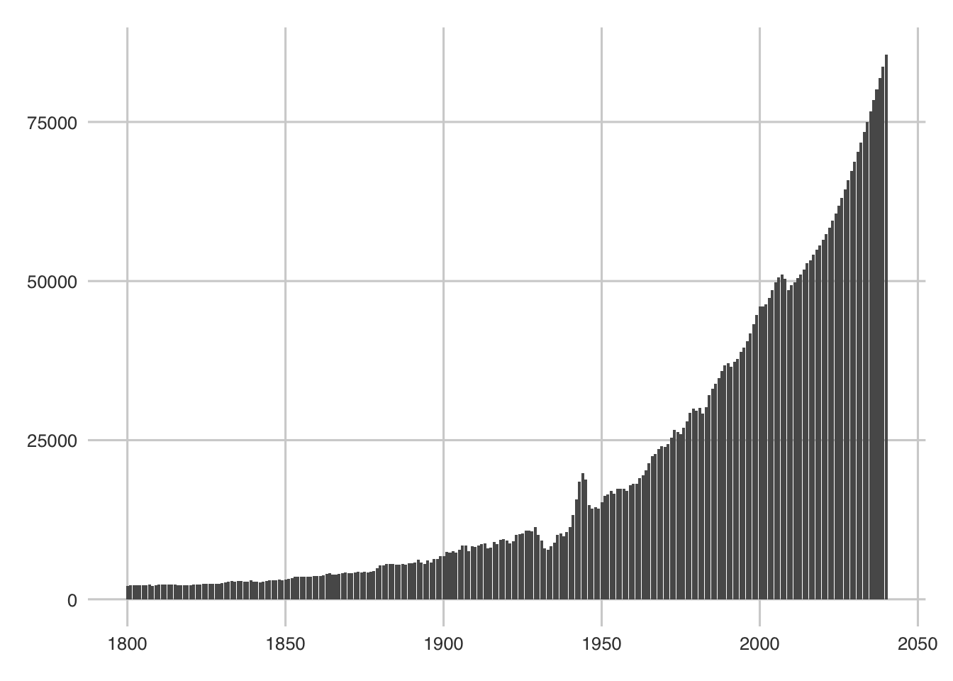
That worked pretty well. Not the most attractive graph... but there it is nonetheless - two lines of code later. Also... check out the '30s. Interesting. Wonder what happened there (clue is in the depressed line).
What if we wanted to look at this income growth for 3 countries? Let's say Germany, US, and France. We can do this a few ways - R has a color/fill argument that can be useful for separating by a given level. Let's use that.
First, as usual, we will pull out our data.
top_three <- tidy_df %>%
  # %in% is convenient function for selecting multiple matching items from a vector
  filter(country %in% c("United States", "Germany", "France"),
         year %in% c(seq.int(from = 1800, to = 2020, by = 20)))

# now we plot
ggplot(top_three) +
  # using geom_bar again
  # now we add two arguments - fill, which tells us to color the bars by country
  # position (I prefer "dodge" - the default is "stack")
  geom_bar(aes(x = year, y = income, fill = country), stat = "identity", position = "dodge")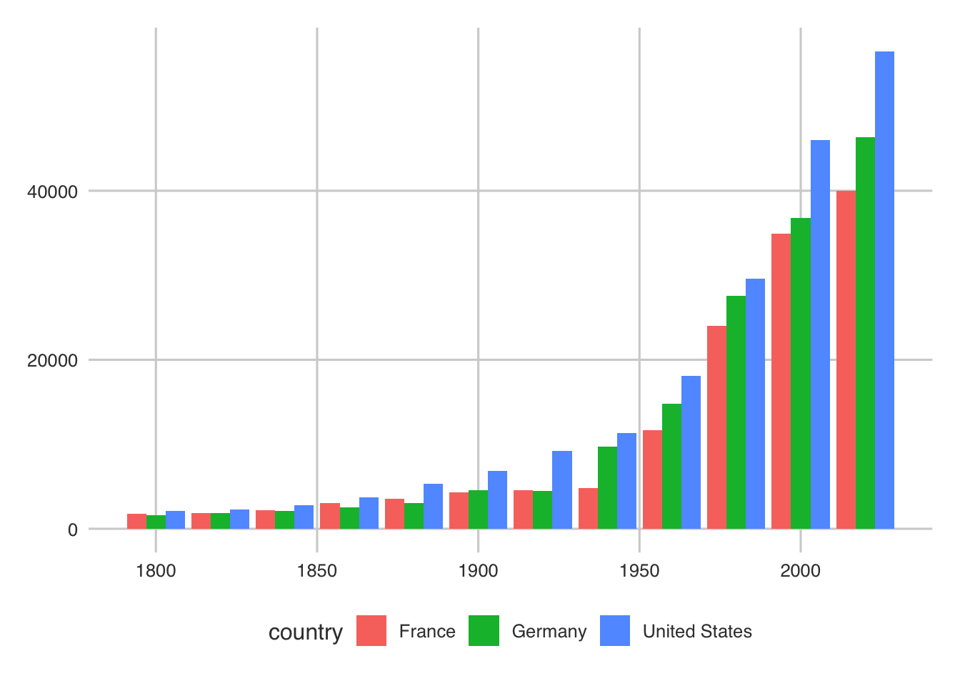
Like all of the examples, you should play around with the defaults and the data to see different results/etc.
Finally, for this example, I want to show you some easy tricks to make this graph a little cleaner. I really like the ggthemes package to make a clean plot space. Go ahead and install it using install.packages("ggthemes").
The ggthemes package has many different themes for ggplot2 so you don't have to create a theme manually (which you very well could do but we don't have time here - or ever, usually). Additionally, we need to neaten up the labels and y-axis (since it should be dollars). I'll show you all three here.
# load ggthemes
library(ggthemes)
# Use the same graph
ggplot(top_three) +
  geom_bar(aes(x = year, y = income, fill = country), stat = "identity", position = "dodge") +
  # now add a theme (scroll through and pick your favorite.. I really like the minimal one)
  # these themes are specified as theme_* - try several out!
  # theme_minimal() +
  # now add your labels
  labs(
    x = "Year",
    y = "Income",
    title = "Income Per Capita for Three Major Countries"
  ) +
  # there are several ways to do this.. I use the scales package
  # scales can do a lot for your axes. Check it out:
  scale_y_continuous(labels = scales::dollar)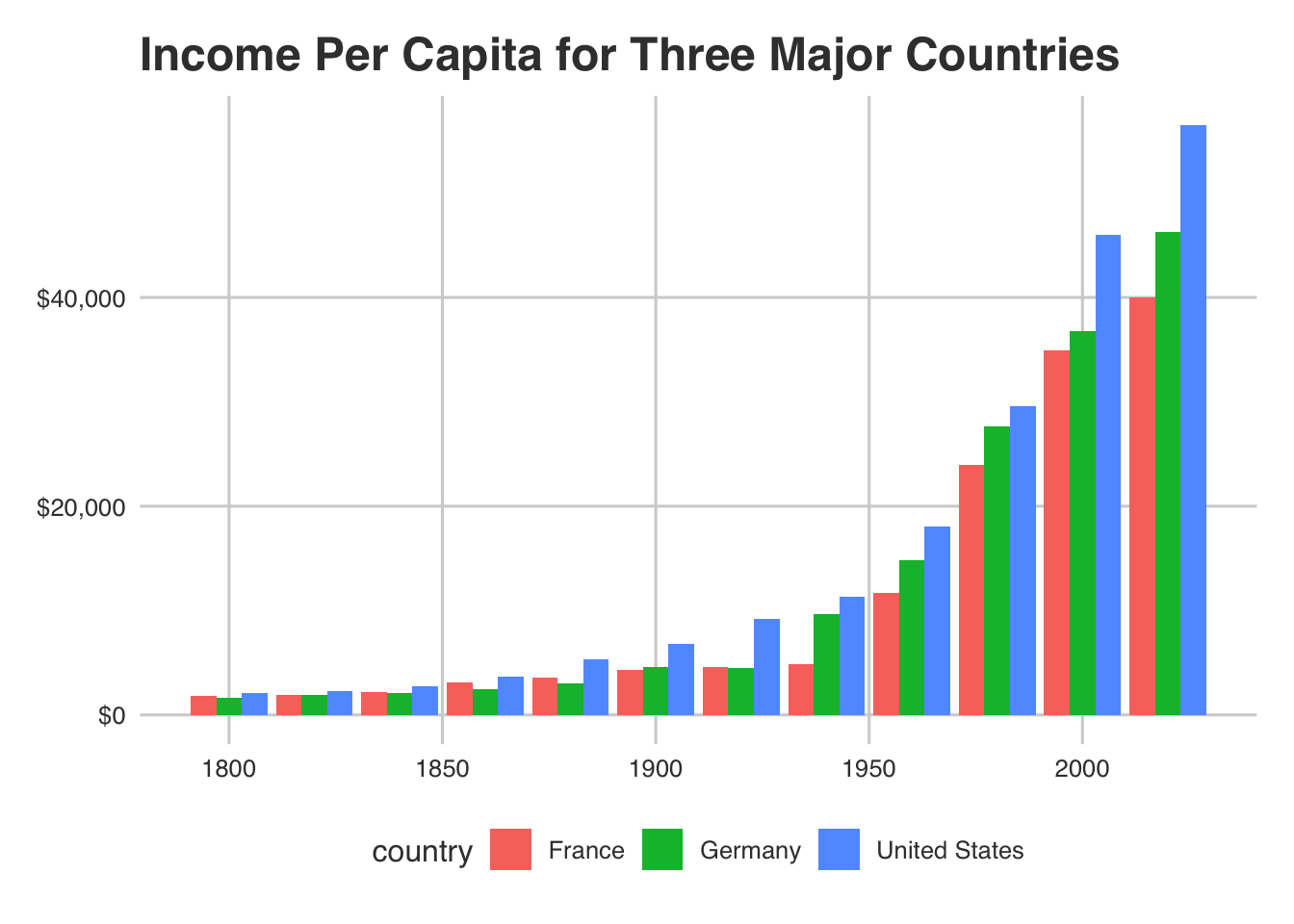
Now you've got the basics of ggplot. Take some time to play around with this before moving on.
Let's go a bit deeper into ggplot2 now.
Dimensions in ggplot2
You've already noticed how to add an extra dimension in ggplot2: specifying a fill lets us distinguish by a given variable not plotted on the x or y axis explicitly (country in our case). I we can do a little more than that. For this exercise, I've taken the liberty of curating a bunch of data and merging it together so we don't need to clean it again - go ahead and download it here.
Store this data as gap <- read.csv2("gapminder.csv").
Now, let's take a look:
str(gap)## 'data.frame': 29346 obs. of 11 variables:
## $ X : int 1 2 3 4 5 6 7 8 9 10 ...
## $ country : Factor w/ 134 levels "Afghanistan",..: 1 2 3 4 5 6 7 8 9 10 ...
## $ Year : int 1800 1800 1800 1800 1800 1800 1800 1800 1800 1800 ...
## $ GDP_per_capita : int 603 667 715 618 1510 814 1850 1240 876 2410 ...
## $ life_expectancy : num 28.2 35.4 28.8 27 33.2 34 34.4 30.3 25.5 40 ...
## $ population : num 3280000 410000 2500000 1570000 534000 351000 3210000 64500 19200000 3140000 ...
## $ continent : Factor w/ 5 levels "Africa","Americas",..: 3 4 1 1 2 5 4 3 3 4 ...
## $ child_per_woman : num 7 4.6 6.99 6.93 6.8 6.5 5.1 7.03 6.7 4.85 ...
## $ child_mortality : num 469 375 460 486 402 391 387 440 508 322 ...
## $ health_spend : num NA NA NA NA NA NA NA NA NA NA ...
## $ maternal_mortality: int NA NA NA NA NA NA NA NA NA NA ...Again, we have GDP per capita (slightly different than income), along with a ton of other metrics. I have already done all the cleaning for each of these variables that we did earlier so this is good to go.
General metrics of progress are GDP per capita and life expectancy. Let's say we want to see the change in these metrics for all the countries in this data set from the beginning of our data (1800) to 2015.
First, let's select the data we want.
gap_selected_years <- gap %>%
  filter(Year %in% c(1800, 2015))
Now, let's use the geom_point() geometry since we want to view both continuous variables.
ggplot(gap_selected_years) +
  geom_point(aes(x = GDP_per_capita, y = life_expectancy))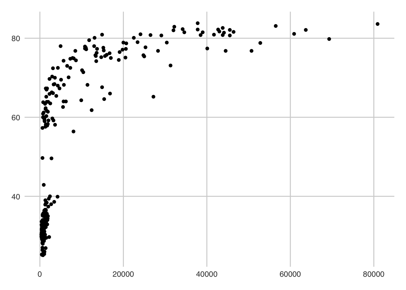
Alright, that's not beautiful... but it is a start. We can see two general clusters - one to the lower left and one gathered around the top. We can guess that these two clusters are the years. We can use the color argument (color is geom_point's fill equivalent) to verify our assumption:
ggplot(gap_selected_years) +
  geom_point(aes(x = GDP_per_capita, y = life_expectancy, color = Year))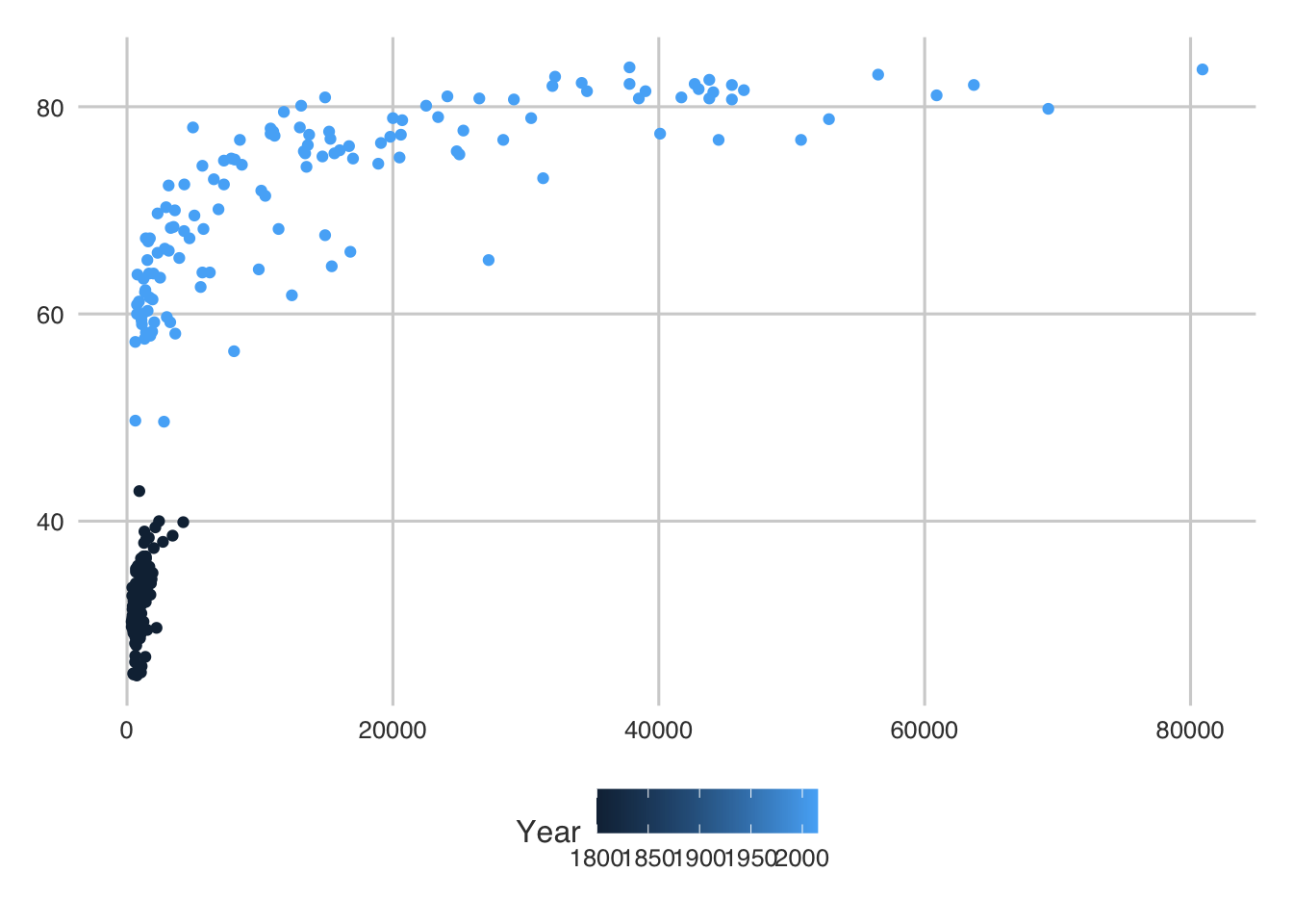
So we were right. But there is still a bit of funkiness going on. First, the legend shows us that R thinks Year is continous... and it was... but for this analysis we should think of it as a factor (or categorical). We could use as.factor(Year) to transform it if we wanted.
Second, the clusters are rough. We can could place these on a log scale to make it a bit more linear.
ggplot(gap_selected_years) +
  geom_point(aes(x = GDP_per_capita, y = life_expectancy, color = Year)) +
  # we can just add a scale to the x axis (there are many of these - check them out!)
  scale_x_log10()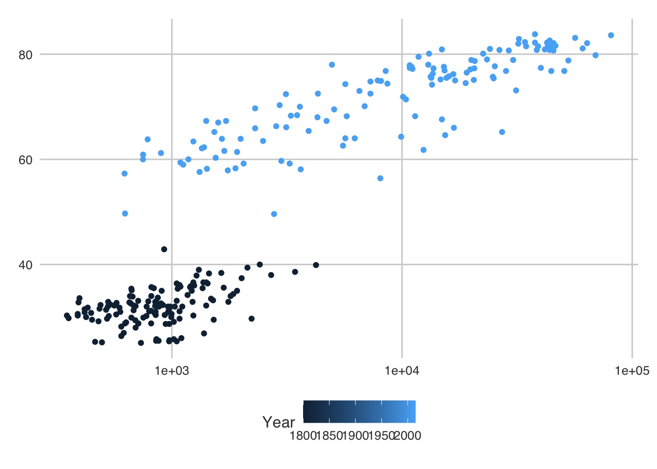
Hey that looks a lot better! In general, we can see that everyone is doing better as a society. Awesome.
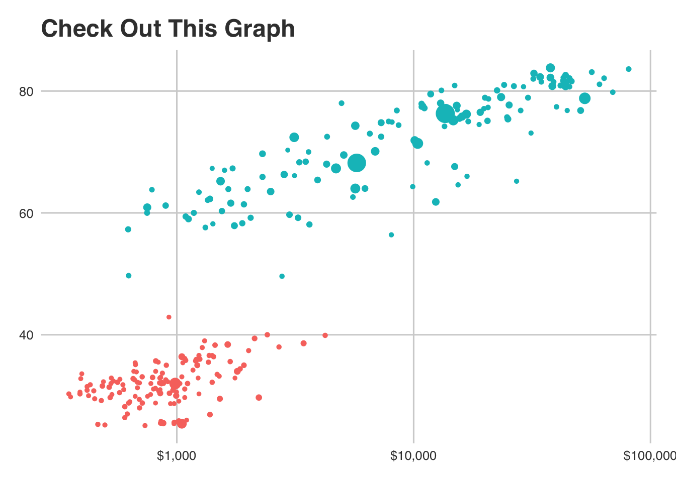
But about dimensions... we have a population variable that we could take advantage of. Let's make the size of each point proportional to their population size.
ggplot(gap_selected_years) +
  # let's add the `size` argument to our aesthetics
  geom_point(aes(x = GDP_per_capita, y = life_expectancy, color = as.factor(Year), size = population)) +
  # fix our log scale (make them dollars)
  scale_x_log10(labels = scales::dollar) +
  # let's get rid of the legends for now...
  guides(size = FALSE, color = FALSE) +
  # and add a theme
  #theme_minimal() +
  # and labels
  labs(
    y = "Life Expectancy",
    x = "GDP Per Capita",
    title = "Check Out This Graph"
  )
But what if we wanted to call out the US, specifically? We could add a shape...
# create a new data frame with a column indicated whether the value is for US or not
gselect_us <- gap_selected_years %>%
  mutate(us_val = ifelse(country == "United States", 1, 0))


ggplot(gselect_us) +
  # let's add the "shape" argument to our aesthetics
  geom_point(aes(x = GDP_per_capita, y = life_expectancy, color = as.factor(Year), size = population,
                 shape = as.factor(us_val))) +
  # fix our log scale (make them dollars)
  scale_x_log10(labels = scales::dollar) +
  # let's get rid of the legends for now...
  guides(size = FALSE, color = FALSE) +
  # and add a theme
  #theme_minimal() +
  # and labels
  labs(
    y = "Life Expectancy",
    x = "GDP Per Capita",
    title = "Check Out This Graph"
  )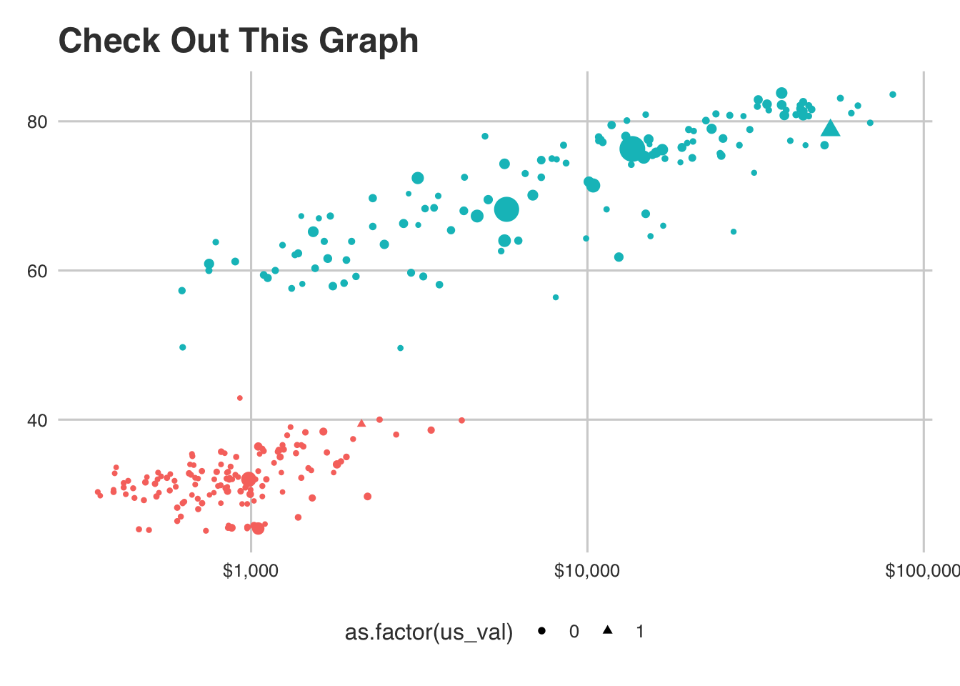
See the triangle? That's the US. And yes, this is getting a little out of hand here... but we should just go one layer deeper. Let's subset the data by who was above the average child mortality rate and who was not.
child_mort_cutoff_data <- gselect_us %>%
  # we are really just interested in the 2015 year...
  group_by(Year) %>%
  # this will give a column to compare child mortality to
  mutate(avg_mort = mean(child_mortality),
         # make a comlumn getting 1 if the avg is greater or 0 if not
         compare = ifelse(child_mortality > avg_mort, 1, 0),
         # hardcoding compare to be 0 if the year is not 2015
         compare = ifelse(Year == 1800, 0, compare)) %>%
  ungroup() %>%
  group_by(country) %>%
  # telling R that the country should get 1 for both dates if it was 1 for 2015
  mutate(compare = max(compare),
         compare = ifelse(compare == 1, "Above Avg. Child Mortality", "At or Under Avg. Child Mortality"))


# Now let us plot it again...
ggplot(child_mort_cutoff_data) +
  # let's add the `shape` argument to our aesthetics
  geom_point(aes(x = GDP_per_capita, y = life_expectancy, color = as.factor(Year), size = population,
                 shape = as.factor(us_val))) +
  # fix our log scale (make them dollars)
  scale_x_log10(labels = scales::dollar) +
  # let's get rid of the legends for now...
  guides(size = FALSE, color = FALSE, shape = FALSE) +
  # and add a theme
  #theme_minimal() +
  # and labels
  labs(
    y = "Life Expectancy",
    x = "GDP Per Capita",
    title = "Change in GDP and Life Expectancy",
    subtitle = "from 1800 to 2015, separated by groups at or above average child mortality"
  ) +
  # now, we add "facets" to group the data into different panes
  # we will use our 'compare' variable for that.
facet_grid(~compare) 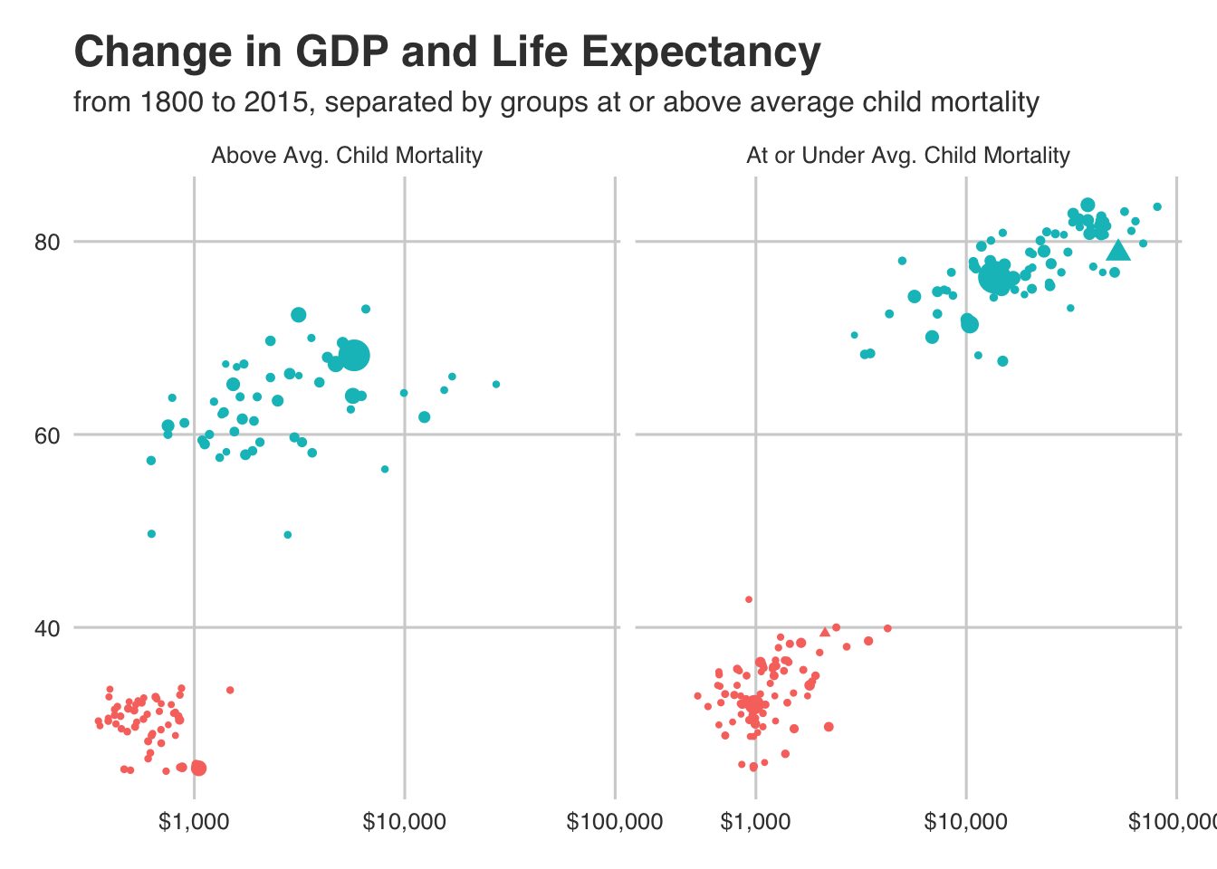
So we just did a lot... and it was a bit of overkill. But it is interesting to see. We know that the US is under the average child mortality rate (the triangle in the right pane). We can also now see that those higher GDP and life expectancy are correlated with better child mortality rates.
This is all just data exploration and we know that looking at associations this way tells us nothing about causation. Though, it can be a good first step!
Hopefully you all are now experts with ggplot and dplyr since we used them both a lot here!